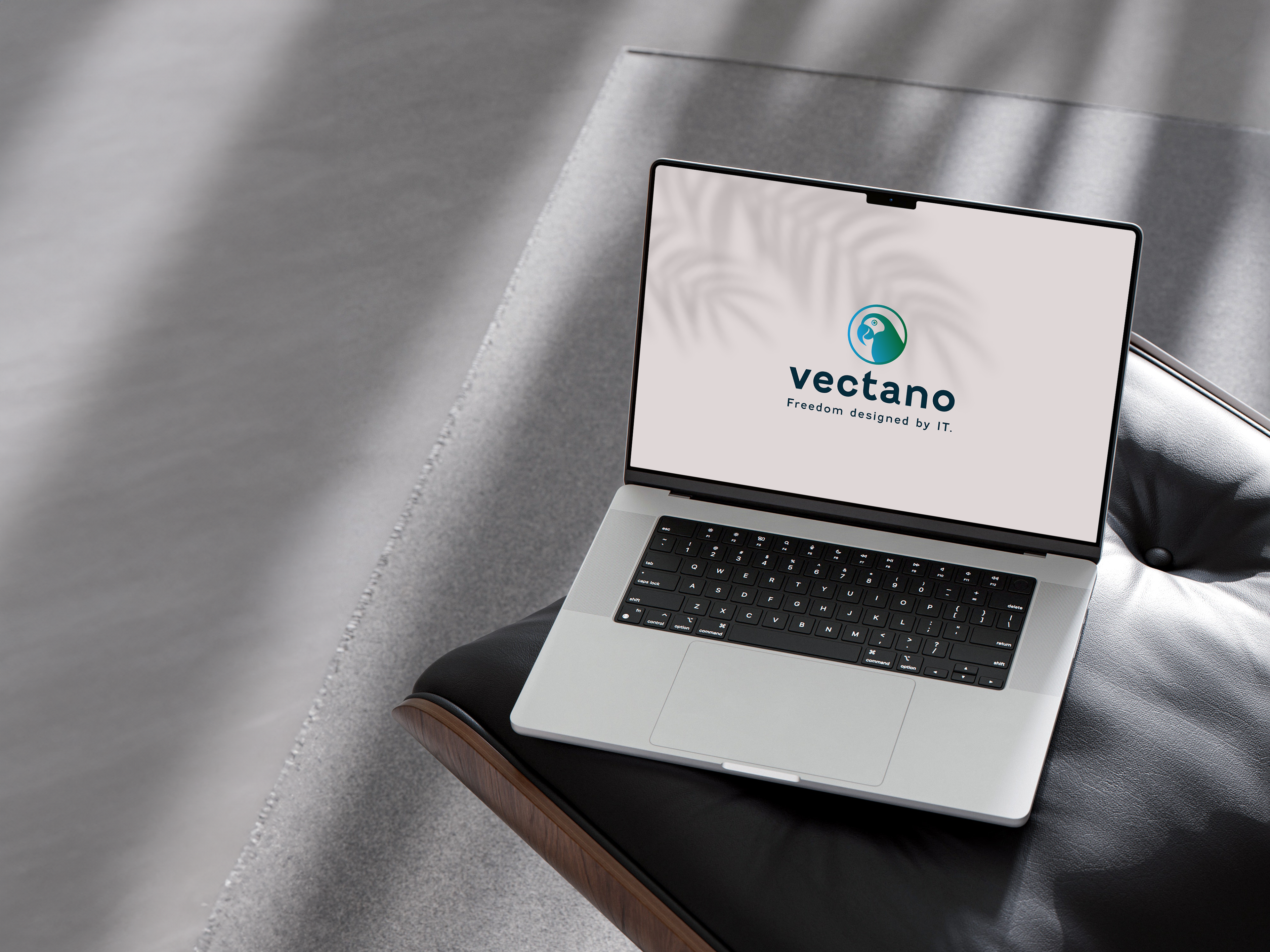
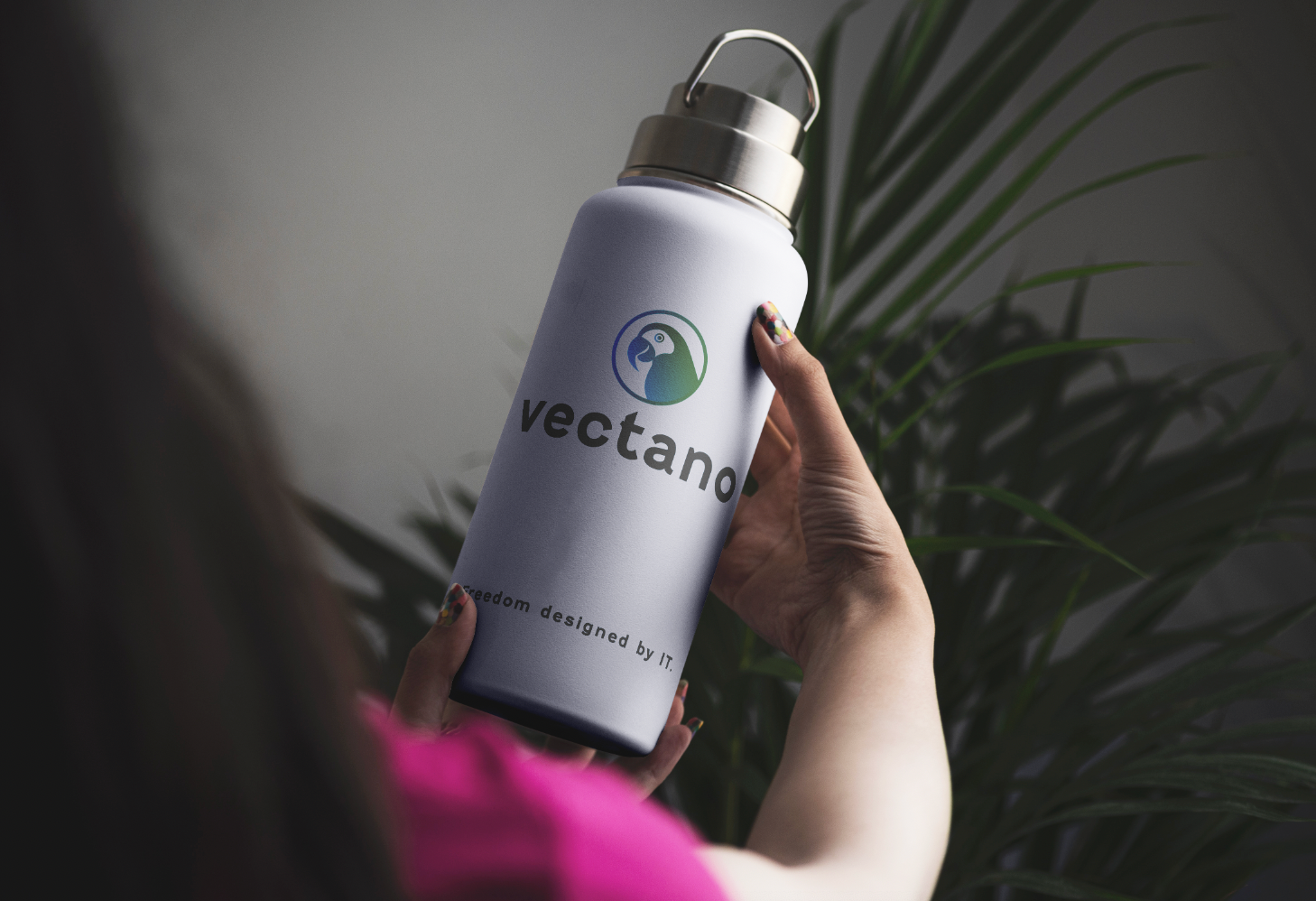
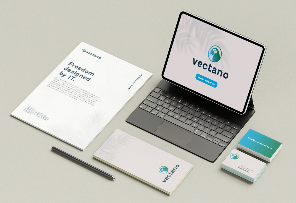
At the heart of vectano's transformative journey, I took the reins in shaping their visual identity. Beyond the creation of the logo, brand colors, and fonts, my involvement spanned the entire spectrum of marketing materials.
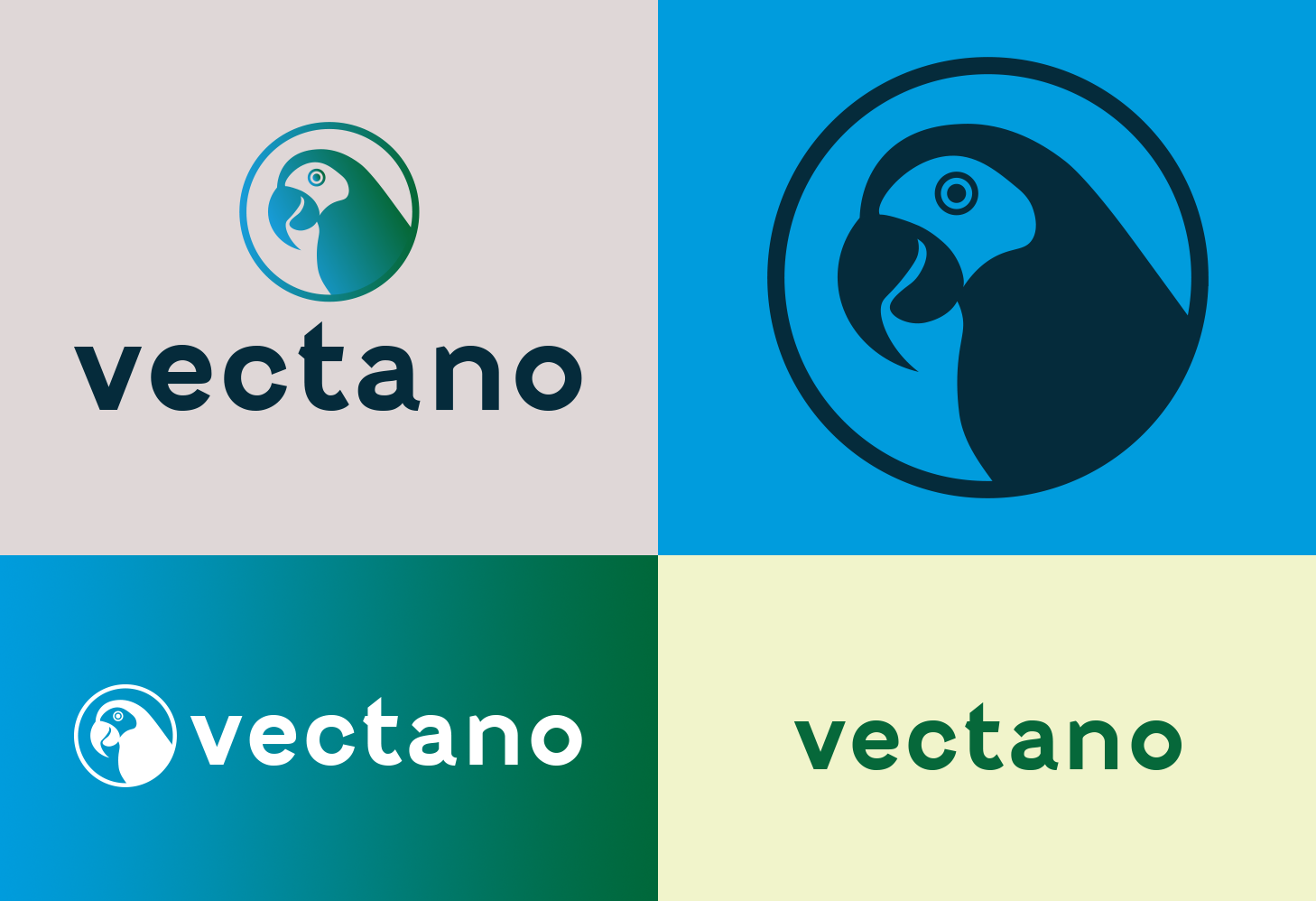
The memorable parrot logo, a product of collaborative brainstorming, encapsulates vectano's essence in a way that sets it apart from other IT companies. This distinctive symbol isn't just a logo; it's a commitment to being more memorable and approachable in an industry often characterized by uniformity.
From building a sleek website to business cards, flyers, and vehicle print applications, every touchpoint reflects vectano's unique character.

Corporate Design
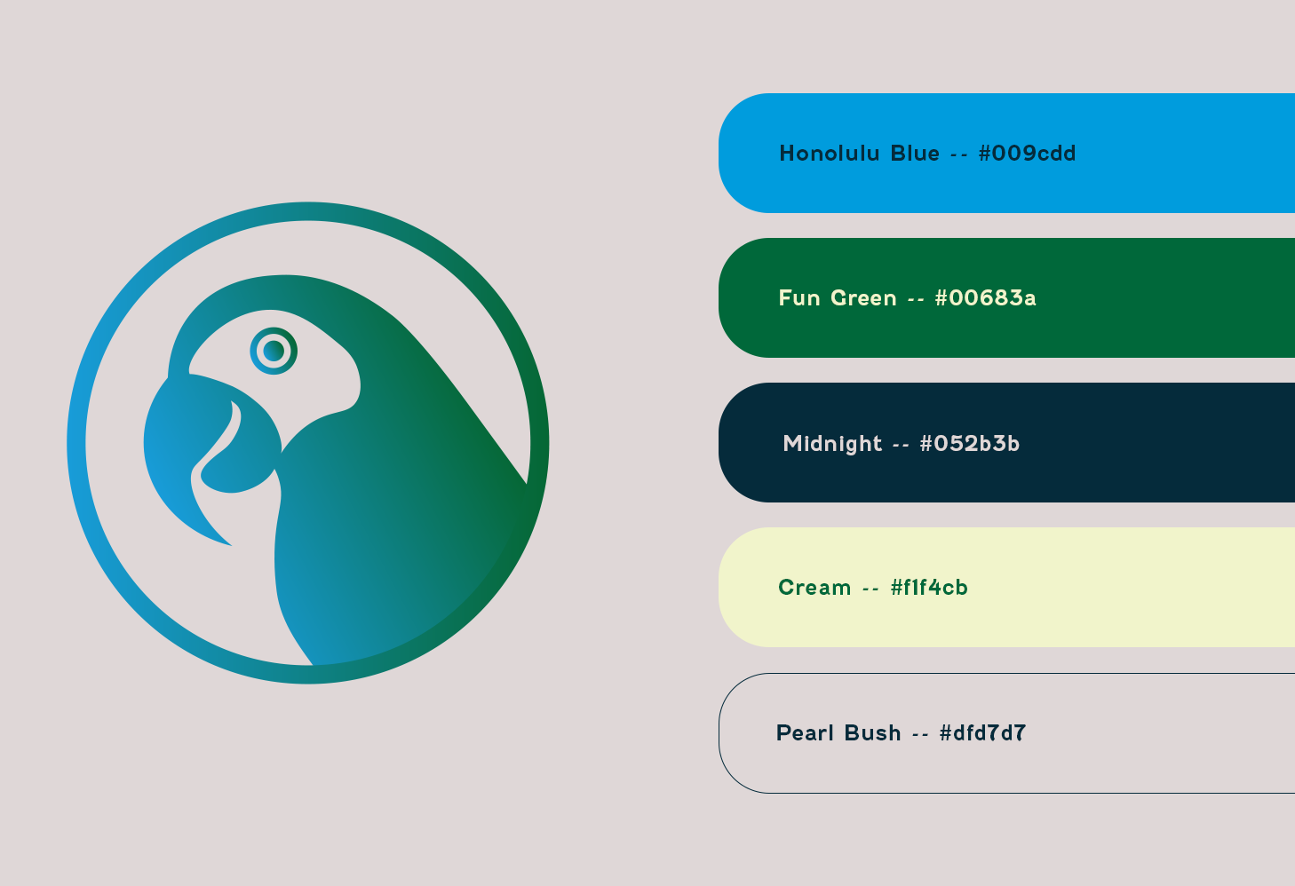
From the vibrant Honolulu blue to the playful Fun Green, I selected colors that break free from the traditional IT palette. While I took the reins in shaping the entire corporate design, the vectano team's collaborative spirit was invaluable. Their insights and brainstorming sessions turned a mere logo into a symbol of innovation and approachability. We wanted a logo that lingers in minds, that breaks the mold of typical IT businesses. The parrot, with its intelligence, sociable nature, and a touch of playfulness, became the perfect embodiment of what vectano stands for.